
iOS Weather App
A redesign focused on clarity, simplification, and aligning the brand standards/design system of a widely used application.
The Challenge:
This design was created from the prompt from Briefbox.me (https://briefbox.me/briefs/create-a-theme-design-for-a-new-weather-app/)
Checking the weather is a common, daily activity that most people do in some form. Some people check the weather to prepare for the day (‘what should I wear?’, ‘Do I need a jacket?’, ‘Will I be too hot if I put on this long-sleeved shirt?’), some people check the weather to plan for the future (Can I plan a BBQ for Saturday or is it going to rain?). This activity is so common, that most (if not all) smartphones come with built-in weather applications or widgets.
There are thousands of weather applications that are available for download on Apple’s app store. While there are enthusiasts out there who crave more in-depth and accurate information than what the default app provides, I believe most people will take the path of least resistance and use an application that already comes installed on their phone if it works well enough for their goals.
With that in mind, I decided to take a look at Apple’s weather app and find ways to improve upon the existing design.
EXISTING DESIGN

Looking at the existing UI, I identified several things that felt like they could use improvement:
The visual hierarchy of the first three pieces of data can be improved. While the location is important, knowing the temperature and the weather status feels more important and should be weighted and positioned thusly.
The labels of ‘Thursday’ and ‘Today’ seem superfluous in this execution. It’s also not entirely clear that this is meant to be a label for the hourly forecast below.
It took me several moments to understand that these numbers were meant to indicate “high” and “low” for today.
Iconography for weather conditions are not visually distinct enough and do not have a lot of contrast against the background of the app. The use of the cloud symbol in several conditions leads to many conditions looking too similar at first glance.
It’s not overly obvious that a user can scroll and reveal more information, and I found it surprising to find this nice, quick summary for the day buried below the 9-day weather forecast.
Similarly, while I understand that the level of detail shown here will not interest most users of the application, it’s not immediately obvious that this information is accessible from the home screen of the app, and it feels strange to bury this information below the 9-day weather forecast without some indication to a user that it’s available to them.
The menu icon is strangely placed and feels inaccurately labeled as a hamburger menu. This design pattern is frequently used to indicate a primary navigation window within an application, but when pressed, it brings up a quick-view list of saved locations with some options to change the temperature from Celsius to Fahrenheit and the ability to add more locations.
The quick-view list has several issues that can be improved upon—clearer iconography to show weather states, better labels to indicate actions and increased visual distinction between different list items.
COMPETITIVE ANALYSIS
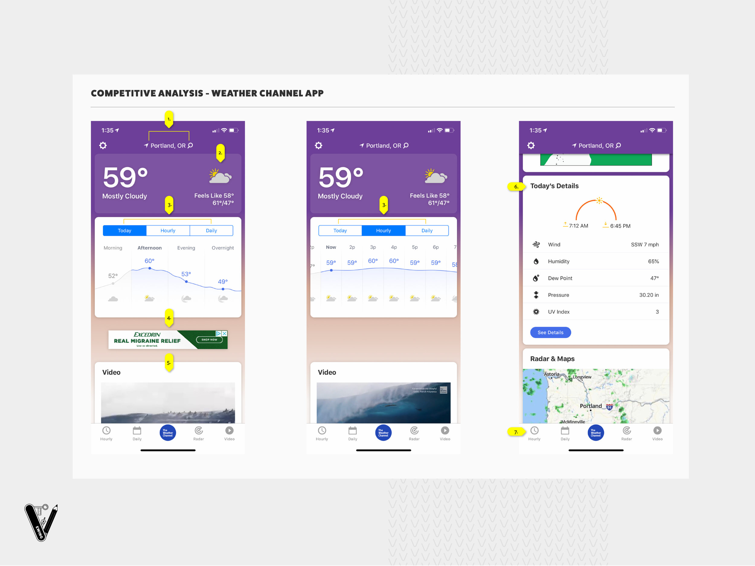
Looking at the weather channel’s app, there were things that I felt they were doing well or could improve upon that differ from the iOS Weather app:
Separating the location from the weather information and including it as a sticky navigation helps clarify that all of the information on the page as you scroll is still related to the same location and not somewhere else.
The use of cards to help visually break up the information is nice, and there’s a clear use of iconography in the first card to help establish the relationship of icon/weather condition for later instances where only the icon is used.
The options for different visual breakdowns for the forecast are accessible via a nice menu bar that has clear labeling.
The use of advertising in the app is a bit distracting and made it hard to follow information as I scrolled.
The inclusion of video was strange, as it was not necessarily video related to the weather in the location.
A further breakdown of additional weather conditions is included in its own card further down the page. Still feels oddly placed to me, since it’s below the 10-day forecast, an ad, and the video card.
The inclusion of a menu with quick links to cards on the page is a nice way to serve up access to key information for users.
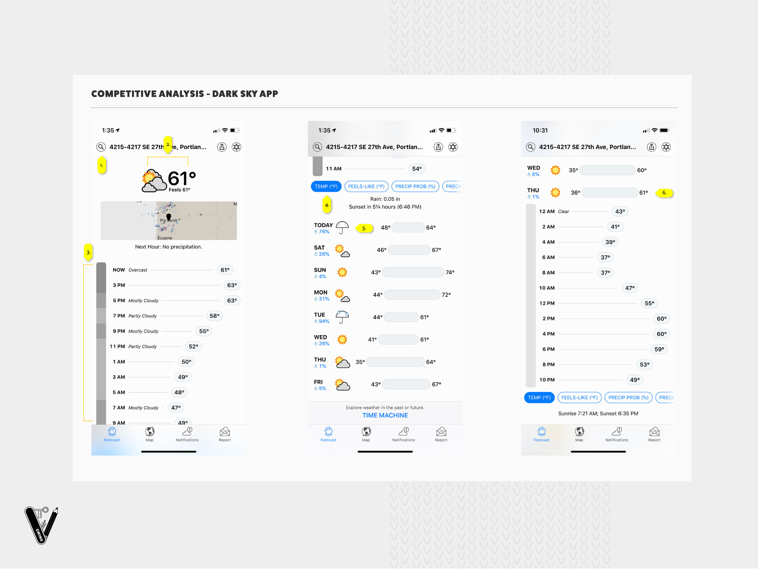
Looking at the Dark Sky app, here were things that I felt they were doing well or could improve upon that differ from the iOS Weather app:
Location and the ability to change location are combined similarly to the Weather Channel app, stickied to the top. The decision to include the exact location feels a little unnecessary and could be simplified, however.
A very simple and clean interface, this app doesn’t use cards, using negative space and grouping relevant information together to establish different sections of data instead. This app has also simplified the amount of information served up front, focusing on temp, feels like, and an icon to represent the weather condition.
Utilizes a bar chart style of displaying hourly temp information, including a quick line of text to describe the weather condition, rather than relying on icons to convey the information. I like this approach since it’s much more descriptive and straightforward and does not rely on needing to interpret the meaning of each icon.
Toggle buttons to manipulate the hourly breakdown chart gives users the ability to see the forecast through the lens of several different types of data.
10-day forecast is included below the breakdown for the day’s forecast. There is a nice use of iconography and graphical elements leveraged to distinguish high/low temps for the day, weather conditions, and precipitation.
Clicking on a day opens up a drop-down that reveals hourly information about the selected day.
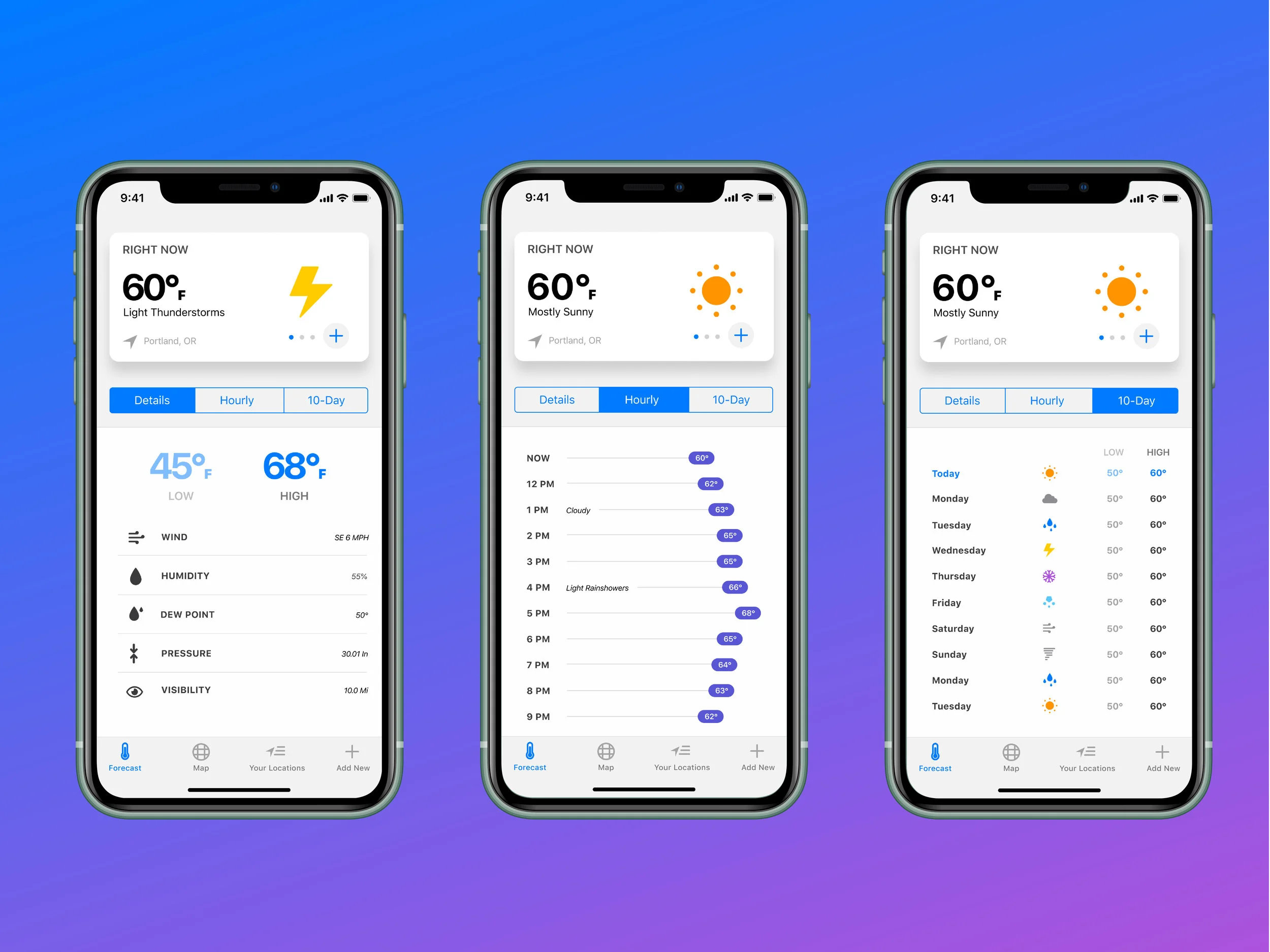
DESIGN PROCESS
After the competitive analysis, I decided to take a look at the design system created for iOS 13 to identify patterns that could be leveraged in a new design of the weather app. Since the app comes pre-downloaded with the phone, it made sense to me to unify it visually with the rest of the brand. Having a cohesive look with the rest of the system will help build familiarity (consistency) and trust as well as speed up development time since it relies on existing structures.
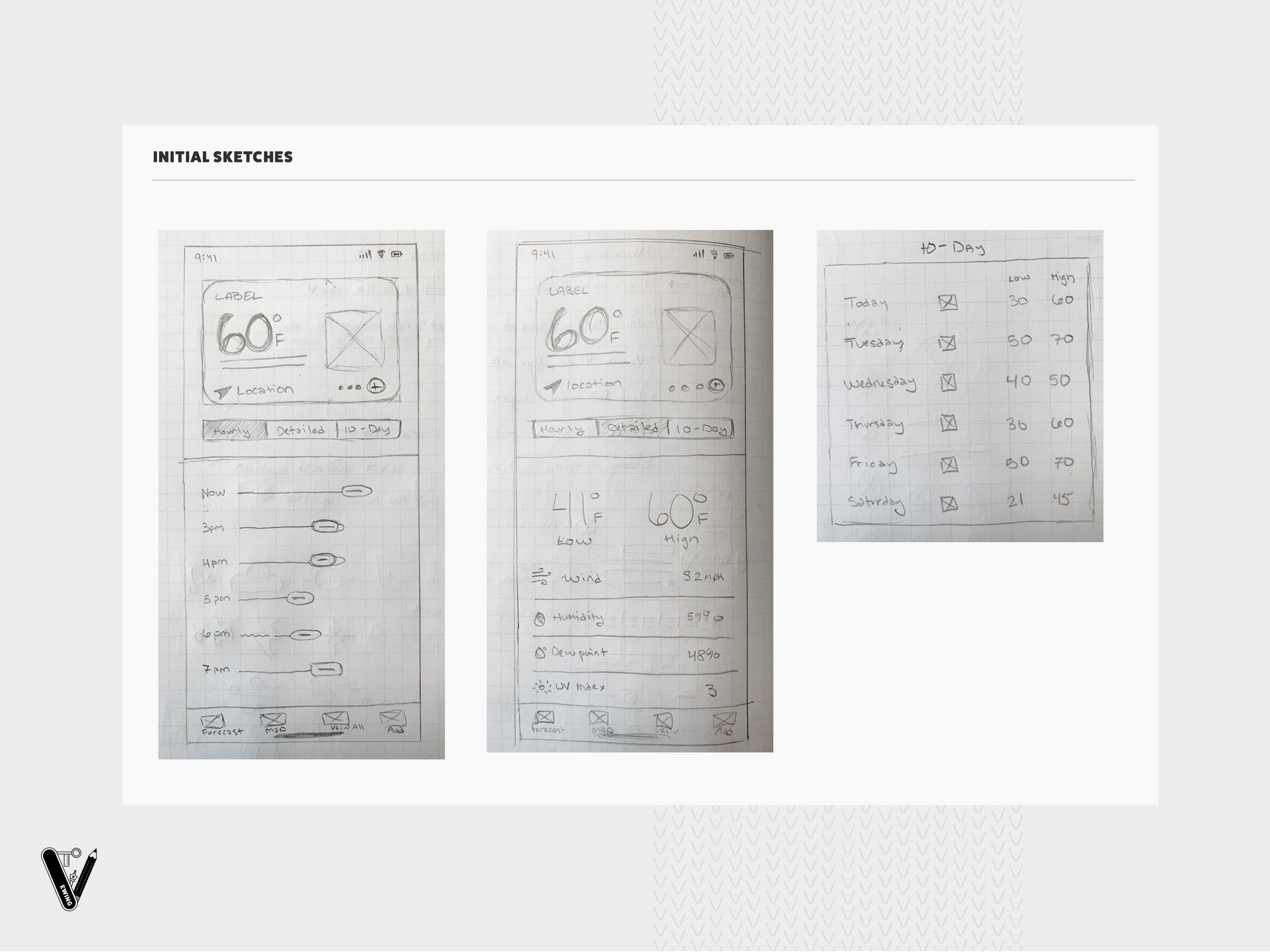
I broke up the home screen into several different screens using the following guidelines for behavior:
Swiping to the left or right on the weather card above would change all of the information for the screen to a new location. I also added the ability to add a new location directly from the card.
All other information about the location’s forecast was separated into toggled screens below the main weather card. I wanted to keep interaction behaviors consistent, which meant leveraging a design meant for vertical scrolling to reveal more information about each section.
I included a menu at the bottom for quick link/navigation to several other key views: a map of the forecast, the ability to see all saved locations in a list format, and the ability to add a new location (in case the button in the card isn’t clear, giving the user a second opportunity)
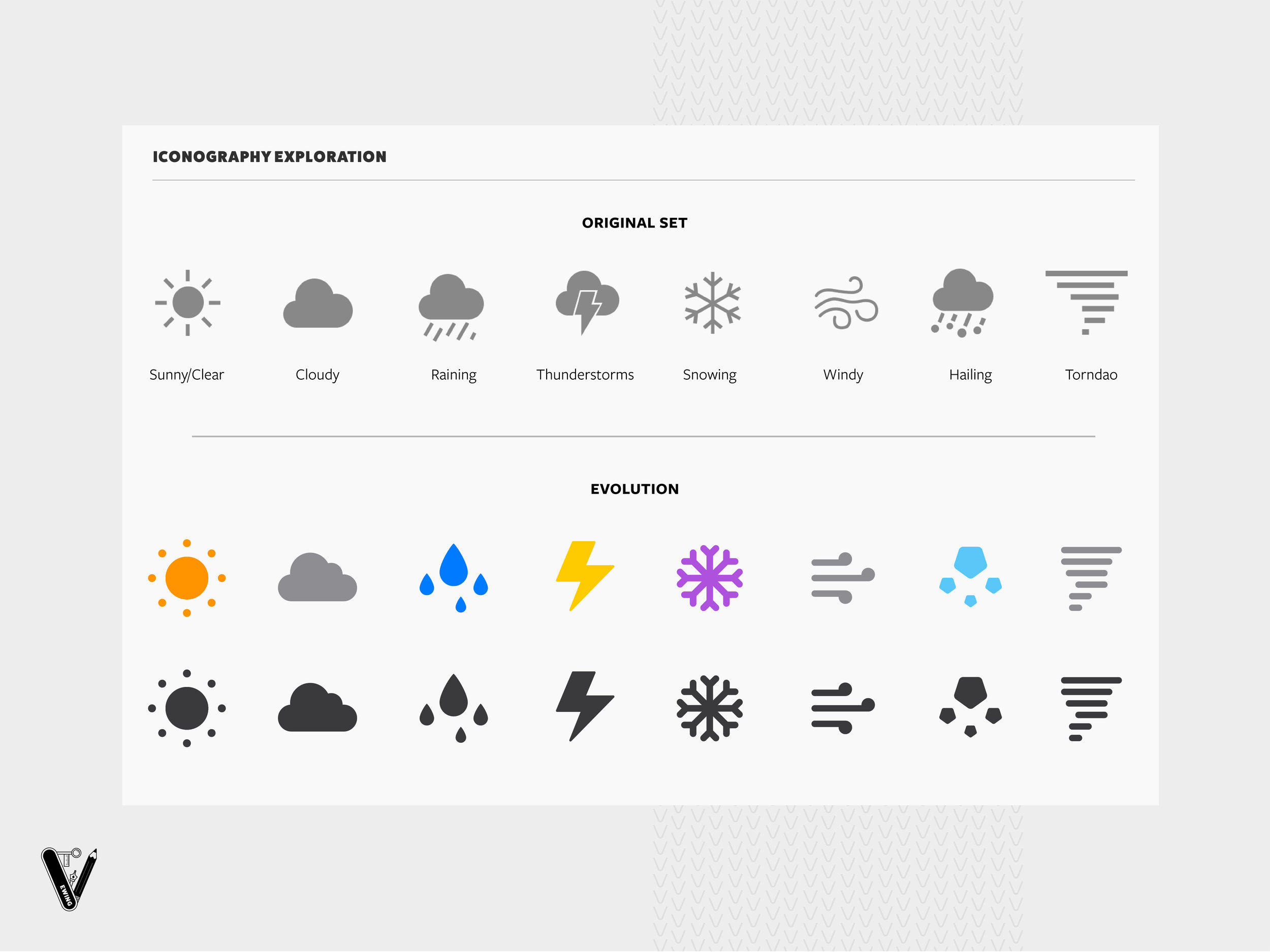
I also decided to tackle the iconography included. When looking at the existing icons, I saw two key issues:
Visual inconsistencies between different shapes - different stoke weights and issues with scale/visual weight. The wind and snow icons do not carry the same weight as the other icons and the tornado icon looks heavier than all the rest
Repetitive icon use - reusing the cloud shape in both the thunderstorm, rain, and hail makes it difficult at a smaller scale to differentiate between the three weather conditions
With that in mind, I developed a simple set of icons that addresses both of those issues.

